
TL;DR — Combining colours in clothing
- Combining colours starts with you, not with the colour wheel. The colour wheel shows you combination methods — but which version of each colour works is determined by your colour type.
- There are five combination methods: monochrome, analogous, complementary, split-complementary and triadic. Each creates a different effect — from calm to high-contrast.
- The three-colour rule is your safety net: one base colour (60 %), one main colour (30 %), one accent (10 %). That is enough for any outfit.
- Your Kibbe type influences where colour sits and how much contrast an outfit can carry — sharp lines wear hard colour changes, soft lines need flowing transitions.
- Neutral colours are not a category of their own. Black, grey, navy and beige have undertones — which is why they do not universally go with everything.
Combining colours in clothing is a skill that works on two levels: the general colour wheel and your individual colour type. The colour wheel supplies the method — which colours harmonise in principle. Your colour type supplies the selection — which shade of each colour works on you. Anyone using only the colour wheel combines correctly in technical terms, but past their own type.
Contents
- What “combining colours” really means
- The colour wheel: your tool for every combination
- The 5 combination methods with outfit examples
- Why your colour type is the foundation
- Combining colours by colour type
- The three-colour rule: 60-30-10
- Using neutrals correctly
- Combining patterns and colours
- Colour and proportion: what your Kibbe type has to do with it
- Step by step: planning outfit colours
- The 7 most common mistakes
- FAQ — Frequently asked questions
What “combining colours” really means
Combining colours in clothing is the deliberate assembly of shades within an outfit so that they create an intended effect — harmonious, high-contrast or full of tension. It is not about placing “pretty colours” next to each other. It is about the colours working with each other and, at the same time, with your skin tone, your hair colour and your eye contrast.
The difference between an outfit that “looks somehow good” and one that truly sits is almost always in the colour composition. Cut and fabric can be perfect — if the colours work against each other, the overall picture looks restless.
“Combining colours works on two levels: the colour wheel tells you which colours go together. Your colour type tells you which version of those colours works on you.”
This distinction is exactly what most guides are missing. They explain the colour wheel, name complementary colours and stop there. But whether you wear coral red or cherry red, teal or ice blue, is not decided by the colour wheel — it is decided by your colour type.
The colour wheel: your tool for every combination
The colour wheel is a circular ordering system that arranges colours by their relationship. It consists of three primary colours (red, blue, yellow), three secondary colours (orange, green, violet) and six tertiary colours created by mixing.
In fashion you do not need the colour wheel as theory, but as a tool. It answers exactly one question: which colours create which effect when I wear them next to each other?
Three terms are decisive here:
- Hue: the pure colour — red, blue, green. That is the position on the colour wheel.
- Saturation: how intense or muted a colour is. Bright red vs. muted brick red.
- Lightness: how much white or black is mixed in. Pastel pink (light) vs. burgundy (dark).
When you combine colours in clothing, you always work with all three properties at once. Two colours can share the same hue and still look completely different because their saturation or lightness differs.
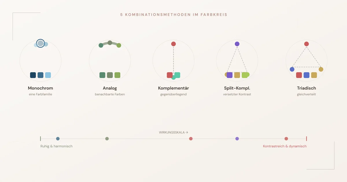
The 5 combination methods with outfit examples
Each method creates a particular visual effect. The choice depends on whether you want calm, tension or a deliberate accent.
1. Monochrome — one colour, different gradations
Monochrome combining means staying within a single colour family and varying only lightness and saturation. An outfit of light blue, mid blue and dark blue is monochrome.
Effect: calm, elegant, lengthening. Monochrome outfits stretch the silhouette because the eye meets no interruption from a colour change.
Outfit example: cream blouse, camel blazer, chocolate brown skirt. Three shades of one colour family, no interruption — the figure looks longer.
Works particularly well for: anyone looking for a calm effect. Especially favourable for petite women, because the continuous colour line creates height.
2. Analogous — neighbouring colours
Analogous colours sit directly next to each other on the colour wheel: blue and green, red and orange, yellow and yellow-green. They share a base tone and therefore look harmonious without being dull.
Effect: harmonious with slight tension. More depth than monochrome, but no hard contrast.
Outfit example: teal jumper, olive green trousers, dark turquoise scarf. The colours flow into each other without merging.
Works particularly well for: autumn and summer types, whose palettes consist of related tones anyway.
3. Complementary — opposites on the colour wheel
Complementary colours sit opposite each other on the colour wheel: blue and orange, red and green, yellow and violet. They create the strongest contrast the colour wheel offers.
Effect: energetic, striking, lively. A single complementary pair dominates any outfit.
Outfit example: navy blue dress with a bag in burnt orange. The contrast draws the eye, but the dosage stays elegant.
Careful: complementary colours in equal saturation and equal surface quickly look loud. The solution: one colour dominates, the other is the accent.
4. Split-complementary — contrast with a safety net
Instead of the direct opposite colour, you take the two neighbours of the complementary colour. Example: instead of blue + orange you take blue + red-orange + yellow-orange.
Effect: as lively as complementary, but less risky. The slight shift takes the harshness out of the contrast.
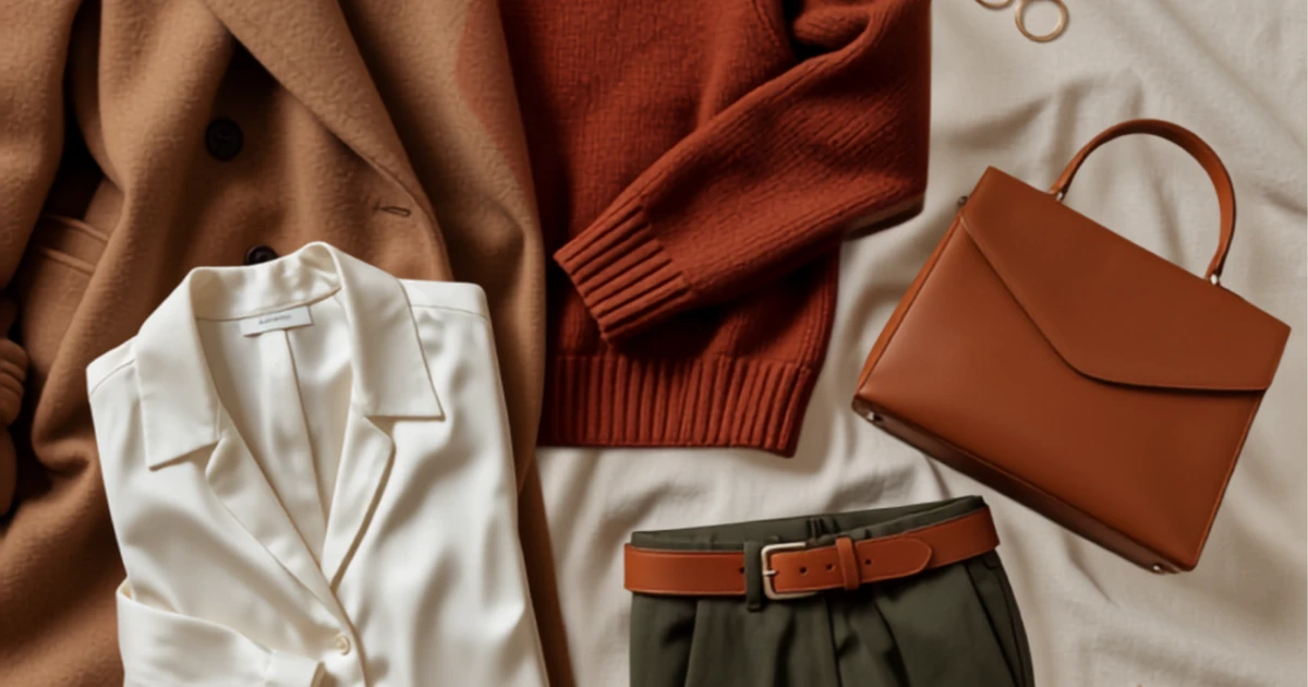
Outfit example: violet jumper, mustard yellow skirt, rust red belt. Three colours that reinforce each other without colliding.
5. Triadic — three evenly spaced colours
Triadic combinations use three colours spaced equally far apart on the colour wheel: red-yellow-blue or orange-green-violet.
Effect: visually complex and lively. Harder to pull off, but with high impact potential.
Outfit example: muted mustard yellow (top), deep blue (trousers), subdued wine red (shoes or bag). The saturation has to be similar across all three colours, otherwise the balance tips.
| Method | Number of colours | Effect | Difficulty | Best situation to use it |
|---|---|---|---|---|
| Monochrome | 1 (in gradations) | Calm, lengthening | Easy | Business, elegant occasions |
| Analogous | 2–3 (neighbouring) | Harmonious, warm | Easy | Everyday, relaxed looks |
| Complementary | 2 (opposite) | High-contrast, lively | Medium | Statement outfits, events |
| Split-complementary | 3 (offset) | Lively, balanced | Medium | Creative everyday looks |
| Triadic | 3 (evenly spaced) | Complex, dynamic | High | Bold, expressive outfits |
Why your colour type is the foundation
Your colour type is the system that determines which versions of a colour work on you and which make you look pale, tired or older. It is based on three properties of your natural pigmentation: the undertone of your skin (warm or cool), the contrast between hair, skin and eyes (high or low) and the depth of your colouring (light or dark).
There are four basic types: spring (warm, light, clear), summer (cool, light, muted), autumn (warm, dark, muted) and winter (cool, dark, clear).
“Every colour exists in warm and cool versions. Red comes as warm tomato red and as cool raspberry red. Both are called ‘red’ — but only one of them suits you.”
That is why the tip “red and blue go together” is only half true. Which red? Which blue? An autumn type needs a burnt brick red with a muted teal. A winter type wears pure cherry red with a clear navy. Both combine red and blue — but in completely different versions.
Combining colours by colour type
This is where it gets concrete. For every colour type there are combinations that work immediately — and others that are technically correct but fail on the type.
Spring type: warm, clear, vivid
The spring type has warm, clear undertones. Their colours have luminosity but no depth. Warm pastel shades with clear saturation work best.
Strongest combinations:
- Coral + warm white + gold
- Apricot + turquoise + camel
- Grass green + sunshine yellow + light beige
- Salmon pink + cognac + ivory
To avoid: black as a base colour (too hard), ice blue (too cool), muted grey (kills the luminosity).
Summer type: cool, soft, muted
The summer type thrives on powdery, slightly muted colours with a cool undertone. Too much saturation overpowers them.
Strongest combinations:
- Smoky blue + lavender + silver grey
- Powder pink + dove blue + cream white
- Mauve + sage green + light grey
- Berry tones + grey-blue + off-white
To avoid: bright orange (too warm and saturated), mustard yellow (wrong undertone), pure black (too hard, anthracite is better).
Autumn type: warm, deep, muted
The autumn type wears earthy, warm colours with depth. Their palette reads like a spice rack: cinnamon, turmeric, paprika, olive.
Strongest combinations:
- Rust red + olive + camel
- Mustard yellow + chocolate brown + terracotta
- Teal + copper + dark beige
- Tomato red + moss green + warm grey
To avoid: pastel pink (too cool and light), neon colours (too artificial), ice blue (wrong undertone).
Winter type: cool, clear, high-contrast
The winter type carries the strongest contrasts and the clearest colours. What overwhelms other types makes the winter type glow.
Strongest combinations:
- Pure white + black + cherry red
- Navy blue + fuchsia + silver
- Emerald green + royal blue + pure white
- Ice pink + anthracite + violet
To avoid: salmon and apricot (too warm), mustard yellow (wrong undertone), washed-out pastels (too little saturation).
| Colour type | Undertone | Best base | Strongest accent | Avoid |
|---|---|---|---|---|
| Spring | Warm, clear | Ivory, camel | Coral, turquoise | Black, ice blue |
| Summer | Cool, muted | Light grey, dove blue | Lavender, mauve | Orange, mustard yellow |
| Autumn | Warm, subdued | Dark beige, olive | Rust red, mustard yellow | Pastel pink, neon |
| Winter | Cool, clear | Black, pure white | Fuchsia, emerald | Salmon, mustard yellow |
The three-colour rule: 60-30-10
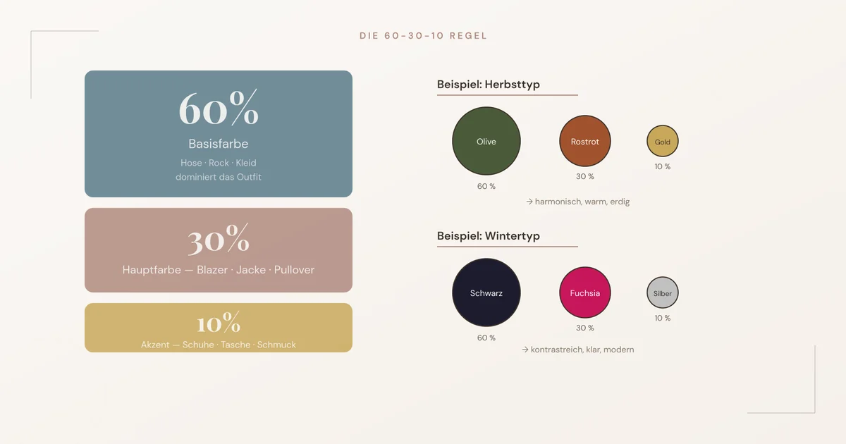
The 60-30-10 rule is a proportion method from interior design that works just as reliably in fashion. It sets how much surface each colour takes up in your outfit.
- 60 % — the base colour. It dominates the outfit. Typically that is trousers or a skirt plus a large top. Neutral or muted.
- 30 % — the main colour. It sets the tone. Usually the blazer, the jacket or a striking top.
- 10 % — the accent. It makes the point. Shoes, bag, jewellery or a scarf.
Why this rule works: the eye needs a clear hierarchy. If three colours take up the same amount of surface, they compete — the outfit looks restless. As soon as one colour dominates, the rest fall into place.
A practical example step by step
- Choose your base colour from your colour type palette: e.g. anthracite (winter type) or dark beige (autumn type).
- Determine the main colour using a colour wheel method: analogous for calm, complementary for tension.
- Set the accent — a small piece in a third colour that goes with the main colour.
- Check the proportions: close your eyes, open them in front of the mirror. What do you see first? If your eye goes straight to the base colour, the distribution is right.
Using neutrals correctly
Neutral colours in fashion are low-saturation colours that serve as a base for colourful combinations: black, white, grey, navy, beige, brown and khaki. The widespread assumption that “neutrals go with everything” is a simplification that regularly leads to mismatched combinations.
Neutrals have undertones too:
- Warm neutrals: ivory, camel, cognac, khaki, warm grey (greige). For spring and autumn types.
- Cool neutrals: pure white, black, anthracite, silver grey, navy. For summer and winter types.
Black as a base colour does not work for everyone. On the spring type, black swallows the natural warmth and contrast of the face. Dark brown or dark blue fulfil the same function — neutral, wearable, professional — without dampening the type.
“Black does not suit everyone — it suits cool, high-contrast types. Everyone else has a better black: dark brown, anthracite or deep teal.”
Navy as the universal alternative
Navy is the neutral with the broadest range of use. In its cool version (pure dark blue) it works for summer and winter types, in its warm version (ink blue with a hint of green) for spring and autumn types. As a base colour it replaces black almost always — with less harshness and more combining power.
Combining patterns and colours
Patterns are colour combinations in the smallest possible space. A striped jumper in navy and white is already a complementary colour combination. A floral dress can use three or four colour wheel methods at once. So the rule is simple: the pattern determines the colour palette of the rest of the outfit.
3 rules for pattern and colour combinations
- Pick up one colour from the pattern. Not the dominant one — the second or third strongest. That connects without doubling up.
- Combine patterns only with solid colours, unless you know exactly what you are doing. Two patterns work only if they differ clearly in scale and contrast strength (e.g. a large paisley + a fine pinstripe).
- The louder the pattern, the calmer its companions. A patterned dress needs a solid coat, solid shoes and understated jewellery.
Colour and proportion: what your Kibbe type has to do with it
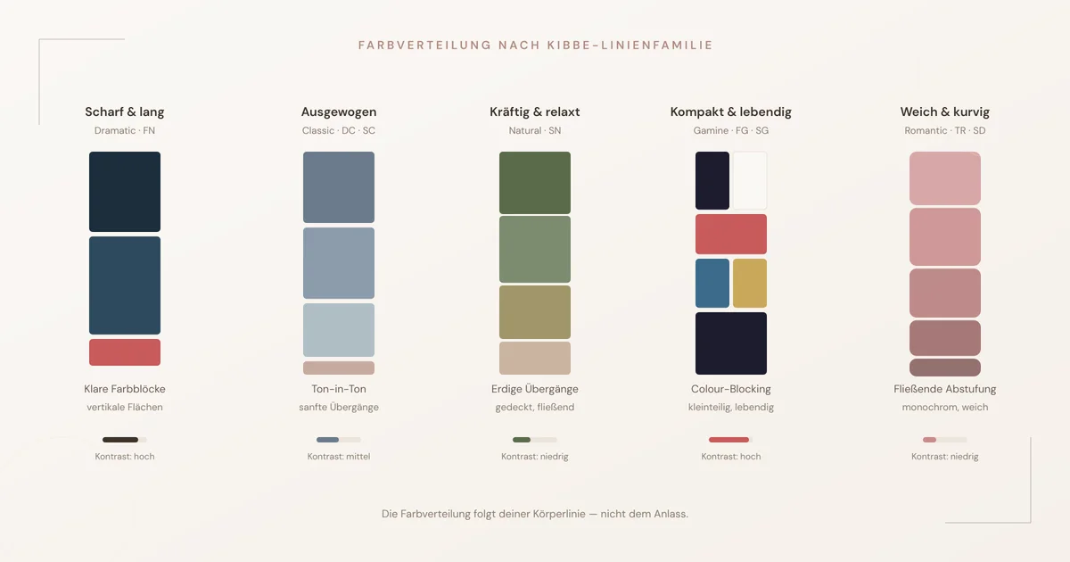
Your Kibbe type influences how colour should be distributed across your outfit. That is because different body lines react differently to colour contrast.
Sharp, long lines (Dramatic, Flamboyant Natural)
Vertical colour progressions and clear, unbroken colour surfaces underline the line. Monochrome and analogous methods emphasise length. Colour changes work best vertically (left/right) rather than horizontally (top/bottom), because horizontal breaks disturb the vertical.
Balanced, moderate lines (Classic, Dramatic Classic, Soft Classic)
Even colour distribution without extreme contrast. The Classic types look best in tone-on-tone or light contrast — not pure black and white, but anthracite with cream. The colours should be as “calm” as the line itself.
Strong, relaxed lines (Natural, Soft Natural)
Earthy, muted colour combinations in medium contrast. Soft Naturals benefit from colours that flow into each other — analogous combinations in subdued tones. Hard colour blocks look stiff on the soft frame.
Compact, lively lines (Gamine, Flamboyant Gamine, Soft Gamine)
Colour contrast works particularly well here. Gamines wear complementary and triadic combinations, because their compact frame holds the contrast without being overwhelmed by it. Small-scale colour changes (colour blocking, contrasting accessories) suit the energy of the type.
Soft, curvy lines (Romantic, Theatrical Romantic, Soft Dramatic)
Flowing colour transitions instead of hard breaks. Romantics shine in analogous and monochrome combinations, because the soft line cannot carry abrupt colour changes. The colour contrast comes through saturation (e.g. deep burgundy next to light rosé), not through complementary colours.
Step by step: planning outfit colours
This workflow works for any outfit — from a Monday morning business look to a wedding guest outfit.
- Determine your colour type if you do not know it yet. The self-test takes 15 minutes — or you can have a professional analysis done.
- Choose your lead piece. That is the piece you definitely want to wear — a particular dress, a new jacket, a favourite scarf. It determines the main colour.
- Decide on the colour wheel method. A calm occasion? Analogous or monochrome. A striking look? Complementary or split-complementary.
- Match it against your colour type. The colour suggested by the colour wheel exists in warm and cool, light and dark, clear and muted. Choose the version that belongs to your type.
- Distribute by 60-30-10. The base colour gets the most surface, the main colour takes centre stage, the accent makes the point.
- Check in the mirror. Step two paces back. If the outfit reads as one unit and not as a collection of individual pieces, the colour combination is right.
The 7 most common mistakes when combining colours
1. Too many colours of equal weight
Three or four colours in equal saturation and equal surface create visual noise. The solution is not less colour, but a clearer hierarchy — one dominates, the others fall in behind.
2. Neutrals as a permanent “safe” solution
An outfit of only black, grey and white is not automatically harmonious. Without an accent colour it quickly looks uniform and erases the natural contrast of the face. A single colour — in the right shade — lifts the entire look.
3. Trend colours without a colour type check
When the season declares butter yellow the trend colour, that does not mean every version of yellow works on you. Winter types wear lemon yellow, autumn types mustard yellow, spring types sunshine yellow — and summer types wear yellow best as an accent in a powdery variant.
4. Mixing warm and cool tones at random
A warm cognac brown next to a cool ice blue clashes, because the undertones pull in different directions. The colour wheel method fits — the temperature does not. Always check: are all the colours in the outfit warm, or all cool?
5. Black for every skin tone
Black is the most overrated neutral. On warm, light types (especially spring) pure black pulls the face down. The alternative: espresso brown, deep teal or dark blue.
6. Ignoring accessories
Shoes, bag, belt and jewellery together often make up 15–20 % of the visible colour surface. If they do not belong to the palette, they disturb the composition — even if each piece “fits” on its own.
7. Treating patterns as colour-neutral
A patterned piece brings all of its colours into the outfit. A floral dress in pink, green and cream is already a three-colour combination. Add a fourth colour in the jacket and a fifth in the bag — and the hierarchy tips over.
FAQ — Frequently asked questions
Which colours always go together?
Navy and white, camel and cream, anthracite and pale pink count as universally harmonious pairs. They work because each combines one neutral and one quietly active colour. “Always” only holds, however, if the variant suits your own colour type — a cool cream white looks grey on an autumn type, a warm ivory looks dirty on a winter type.
How many colours may an outfit have at most?
Three main colours are the safe upper limit for a coherent outfit. On top of that come neutrals, which do not count as a colour of their own as long as they belong to the base. Anyone wanting to wear more than three colours needs a clear hierarchy — one colour dominates, the others are accents. Without that order the outfit looks restless.
Can I wear black and brown together?
Yes, if the brown is dark enough to form a soft contrast with the black, and not mid-light, where it reads as “not quite matching”. Espresso brown and black work; camel and black need at least a third colour as a bridge. The combination works best on autumn and winter types.
Which colour goes with beige?
Beige is a warm neutral that takes almost every other warm colour: rust red, olive, mustard yellow, cognac, coral, teal. With cool colours such as ice blue or fuchsia, beige only works if the beige itself is cool enough — so taupe rather than camel. For cool colour types, light grey is often the better alternative to beige.
Does gold or silver suit me better?
Gold suits warm colour types (spring and autumn), silver suits cool ones (summer and winter). That comes down to the undertone: gold has a yellow-warm shimmer, silver a blue-cool one. Rose gold sits in between and works with a warm undertone with a slight rosé cast. You will find a detailed guide in Jewellery by colour type.
How do I combine pastels without looking washed out?
Pastels work best on light colour types (spring and summer), because the low saturation matches their own contrast. Dark types (autumn and winter) need a counterweight: a single piece in a deep colour as an anchor. A pastel pink blazer over a navy top looks coherent on a winter type; a fully pastel outfit does not.
What are complementary colours, and how do I use them in an outfit?
Complementary colours are pairs that sit opposite each other on the colour wheel: red and green, blue and orange, yellow and violet. They create the strongest visual contrast. In an outfit you use them in measured doses — one colour as the main surface, the complementary colour as the accent. A navy dress with a cognac bag is a complementary pair in a muted execution.
Can I use the colour wheel for evening wear and formal occasions too?
The colour wheel applies to every occasion. For formal occasions and dress codes, what changes is not the method but the fabric and the saturation. Evening wear carries deeper, more saturated colours and shiny surfaces — but the combination logic stays identical. Monochrome in dark blue looks just as coherent at dinner as in the office, only in silk instead of cotton.
Why do some colour combinations look different on screen than in reality?
Screens show colours in RGB light, fabric reflects daylight. The difference mainly affects saturation and undertone: an online mustard yellow can arrive noticeably more orange or more green. Always check colours in daylight by the window — artificial light shifts the undertone and makes cool colours warmer and warm colours flatter.
How do I find out whether a colour is warm or cool?
Hold the fabric next to a pure white and a pure black. If it looks better next to black and yellowish next to white, it is warm. If it looks fresher next to white and shimmers bluish next to black, it is cool. When in doubt, a direct comparison helps: place a warm red (tomato red) next to a cool red (raspberry red) and watch the difference in undertone.
Your next step
Combining colours becomes easy as soon as you know two things: the method (colour wheel) and your material (colour type). If you have not yet pinned down your colour type, start with the colour type self-test. If you want to go deeper, the guide Combining colour type & Kibbe type shows you how to bring both systems together.
For an individual analysis — with a personal colour palette, combination suggestions and a shopping guide — style consulting is open to you. The free initial conversation takes 30 minutes.